Inspiring Local Government Website Designs
Six websites that showcase how resident-focused design, strong engagement tools, and accessible experiences work together
In many cases, your website is the very first interaction a resident, visitor, or business has with your local government. That makes your website the digital front door to your community.
Every municipality is unique, from large metropolitan areas to small rural communities, and your website should reflect that identity. A strong local government website combines clear navigation, accessible design, and compelling visual storytelling to accurately represent community values while making it easy for users to find information and complete tasks.
If you are planning a local government website redesign, the six examples below highlight proven design approaches that improve usability, support accessibility, and strengthen digital resident engagement.
James City County, Virginia: Simplifying Housing Access Through Digital Services
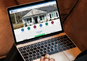
James City County launched a centralized Housing Resource Portal that makes it easier for residents to find rental assistance, food resources, and housing support in one place. The streamlined experience reduced confusion for users while cutting down on repetitive inquiries for County staff. Between July 2024 and June 2025, key program pages saw major growth, including a 98% increase in views for income-based rentals and a 117% rise in visits to pages for local food bank information. As a result, staff spend less time answering basic questions and more time supporting residents directly. Visit James City County’s Housing Resource Portal website.
Awards: 2025 Community Impact Awards Winner | 2024 NAGW Members Choice Award Winner
City of Fort Wayne, Indiana: Accessibility Meets Usability
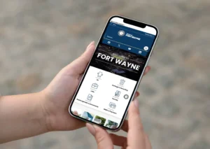
The City of Fort Wayne’s website had not been redesigned since 2014, creating barriers for residents due to poor mobile performance, limited search, and disorganized navigation. A comprehensive redesign delivered a modern, resident-first experience with intuitive navigation, robust search, built-in video, AI-assisted tools like the CivicPlus Chatbot, and improved accessibility across the site. Accessibility improvements were validated directly by members of the community, who reported better screen reader compatibility and easier navigation. Residents responded immediately with positive feedback, citing easier access to City Council documents and online services. The new site positioned the City of Fort Wayne for continued digital growth and stronger community engagement. Explore the City of Fort Wayne, Indiana’s redesigned website.
Read the full case study for the City of Fort Wayne, Indiana.
Windsor, Colorado: Strengthening Public Trust Through Accessible Web Design
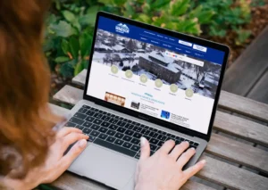
Windsor expanded its CivicPlus municipal website into a centralized digital hub that serves nearly 47,000 residents. The redesign aligned with Section 508 of the Rehabilitation Act and Colorado House Bill 21-1110, while introducing features like dyslexia-friendly fonts, adjustable text options, and structured headings. These enhancements help ensure residents of all abilities can access town services, information, and civic tools. By making accessibility a foundation of the site, Windsor strengthened trust and reinforced its commitment to inclusive community engagement. Visit Windsor, Colorado’s accessibility-driven website.
Planning a Website Redesign?
Download our Website Redesign Tool Kit to help you evaluate your current site and plan for a more accessible, resident-centered digital experience.
Town of Sherborn, Massachusetts: A Clear, Connected Digital Experience
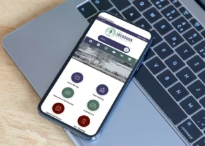
The Town of Sherborn designed its website to create a clear, intuitive digital hub for residents, businesses, and visitors. The site features strong branding, simple navigation, robust search, and a mobile-responsive design that makes information easy to find on any device. Residents can quickly access a community calendar, online bill payments, and centralized agendas and minutes for public meetings. The website also supports resident engagement through a dedicated community section, town project updates, and information on land development initiatives. Together, these tools help Sherborn communicate more effectively and keep residents informed and connected. Explore the Town of Sherborn, Massachusetts’s award-winning website.
Award: 2025 Massachusetts Municipal Association Municipal Website Award Winner
Chesterfield County, Virginia: Resident-Driven Website Redesign
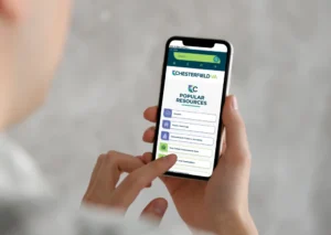
Chesterfield County’s website redesign was shaped by direct input from residents, county departments, and community stakeholders. The new site delivers a faster, more intuitive experience optimized for mobile users, who account for 59% of site visits. Improved navigation, faster load times, and touch-friendly interactions make information easier to find on any device. The launch also introduced the County’s new brand, using visual storytelling to reflect its community identity online. Take a look at Chesterfield County, Virginia’s multiple award-winning website.
Awards: Two-time CivicPlus Award Recipient | 2024 NAGW Pinnacle Awards & Members Choice Award Winner | Two-time 2024 dotCOMM Award Winner
Rancho California Water District: A Smarter Digital Approach to Resident Updates
 Rancho California Water District enhanced its website with a real-time emergency alert feature to improve communication during water outages. A five-stage repair progress graphic helps customers quickly understand restoration status without calling Customer Service. This approach reduced call volume while improving clarity and trust during service disruptions. Proactive notifications through text, automated calls, and social channels further strengthened customer engagement. View Rancho California Water District’s website.
Award: CivicPlus Award Recipient
Build a Website Made Specifically for Your Community
The best city and town websites are built with residents at the center. When design, content, and functionality align with resident needs, websites help strengthen communication and encourage meaningful engagement. CivicPlus partners with local governments to create digital experiences that make information easier to access and services easier to use. Start a self-guided tour to discover how we support communities at every stage of their digital journey.
