# Website Design & Communication
The 6 Hottest Trends in Web Design For Government
From bold colors to geometric imagery, we're bringing you hot trends in government website design.

CivicPlus
January 11, 2017
10 min
Content focused. Animated. Personalized. Colorful. These are just some of the terms that are impacting local government website design. If you think your government website can’t take advantage of the latest, modern, eye-catching trends, think again. This year’s list of top trends offers something for everyone, including easy-to-implement design updates that can take your municipal website from ordinary to outstanding. Here are the six trends helping local governments create award-winning websites:
1. Content-focused Layouts
Content is king. You already know that, though, because your job is to keep people in your community informed. Today, we are seeing a growing number of websites being designed to give various types of content the prominence and easy access they deserve. Expect to see websites that let content like photo galleries, social media posts, videos, and valuable information shine.
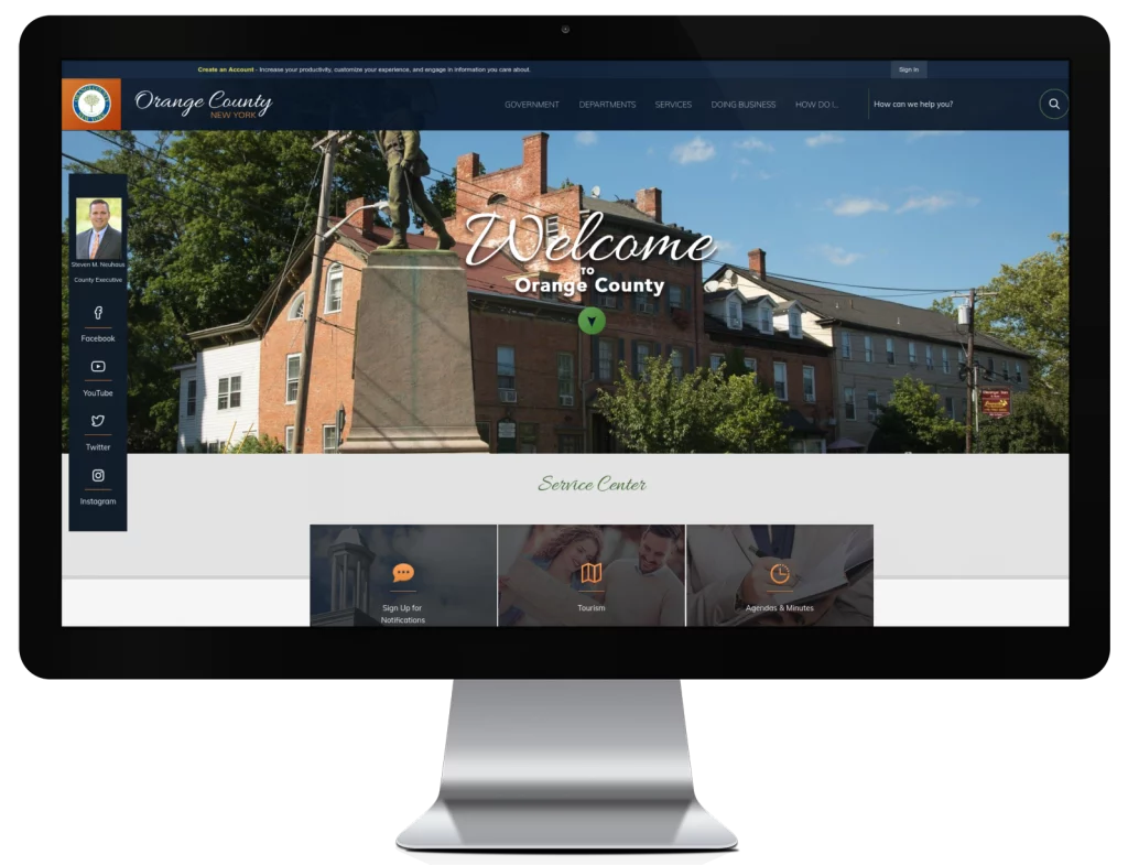
Check out how the progressive community of Orange County, New York, has incorporated a variety of image-based content into its homepage.
2. Big, Bold, Beautiful Colors
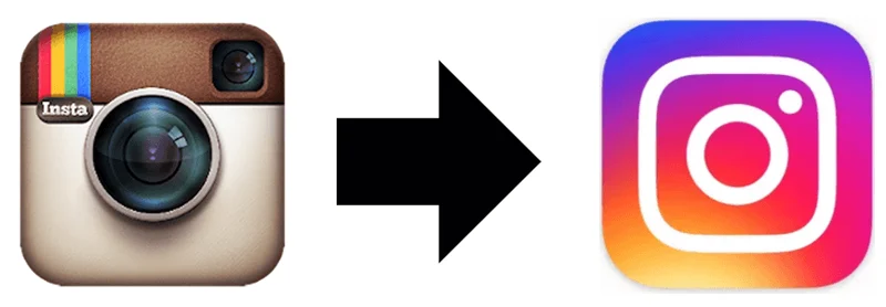
The last few years have seen a turn toward minimalist web design, with lots of white space, clean-looking pages, and non-obtrusive, thin, delicate fonts. The online community is ready to start seeing bright, bold, vibrant colors. Even the largest digital influencers are using color to make a statement. Social media giant Instagram recently overhauled its logo, changing it from a dull brown camera icon to vibrant pink, purple, and yellow iconic symbol.
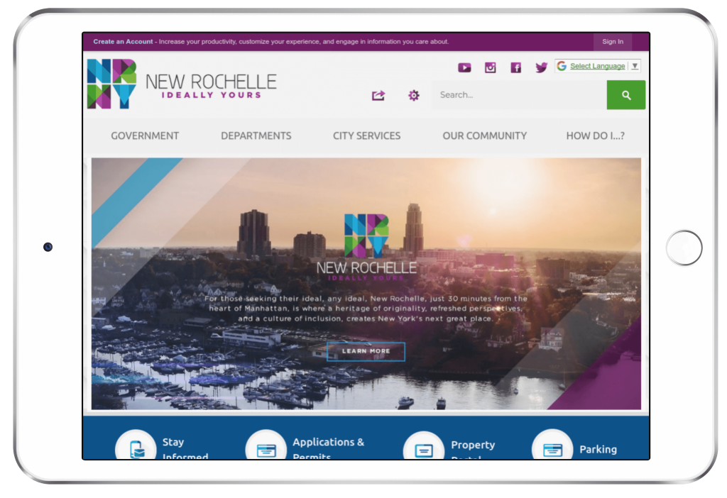
Check out how the colorful City of New Rochelle, New York proves why their community deserves to stand out using vibrant blues, teals, greens, and purples.
3. Moving Animation
Thanks to advancements in web browsers and programming languages, it’s now easier than ever to apply impactful, engaging, and beautiful animations. Animation can be a powerful way to tell a story, convey a feeling, or demonstrate the beauty and individuality of a community.
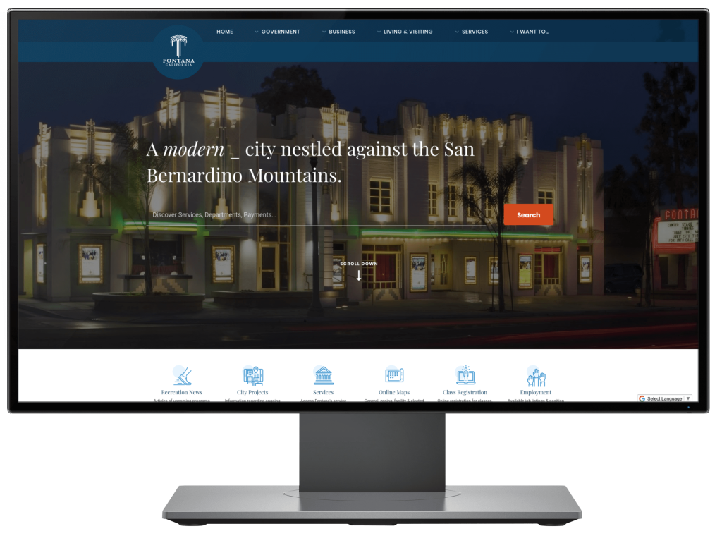
Check out how Fontana, California, has used animation to establish everything that is unique about its community.
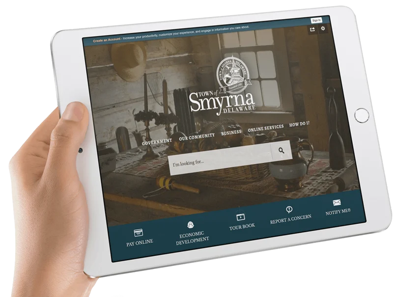
4. Flat Design
It used to be a popular design trend to portion-off individual areas of content into self-contained areas. As a result, you’d see websites with lots of boxy elements, like the main square photo, and below it, three boxes of text accompanied by three aligned square photos. In 2017, we are expecting to see designs that are open and boundless. Think images without borders and text without boxes. See how the Town of Smyrna, Delaware’s homepage offers a single edge-to-edge photo and non-boxed links?
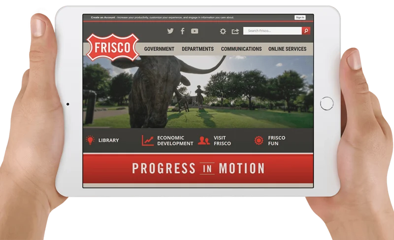
Here’s another example from Frisco, Texas, of a homepage free of segmented, contained content.
5. The End of Stock Imagery as We Know it
When you see a stock photo, you can tell in an instant. The forced poses of the models, the plastered grins, even the quintessential composition. Today’s website visitors are fatigued with canned stock photography, which is why we’re now seeing much greater use of custom, expressive, unique photography. This trend will be especially noticeable in government website design. You want to choose photos that represent your real-life community and everything that is unique about it. The ability to incorporate custom imagery into government websites has been extremely impactful in earning resident praise and appreciation for the government websites that have implemented a more authentic approach to imagery.
As an example, see how the community of Coon Rapids, Minnesota, prominently displays regularly rotating, always local imagery in prominent positions on its homepage.

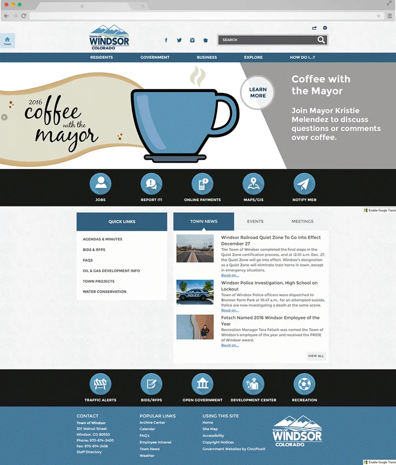
6. 3D Geometric Icons and Imagery
Icons may seem like small design elements (literally, small), but they can make a big impact on the overall look and feel of a website. In the past, when it first became popular to use icons in place of text, designers felt they needed to create icons that were realistic representations of the words they replaced in order to be understandable. Over the years, icons became extremely abstract and one-dimensional.
For example, consider how Apple has updated some of its native app icons over the years to move from realistic to abstract:
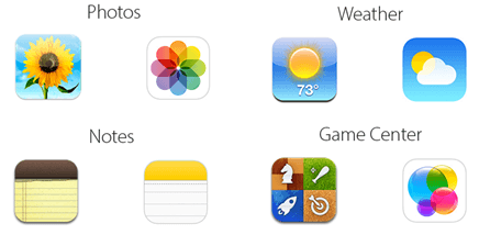
We’re now seeing icons settle comfortably somewhere in the middle of the realistic and the abstract. Expect to see the introduction of three-dimensional geometric iconic shapes and images. See how the Town of Windsor, Colorado executes its version of dimensional icons to build intuitive homepage navigation.
As you build your content and communication strategy for your community, don’t forget to consider how implementing even one or two of the latest design trends may help you to meet your civic engagement objectives. If you’re considering a new website for your municipality, look no further than our Municipal Websites software.
Written by
CivicPlus